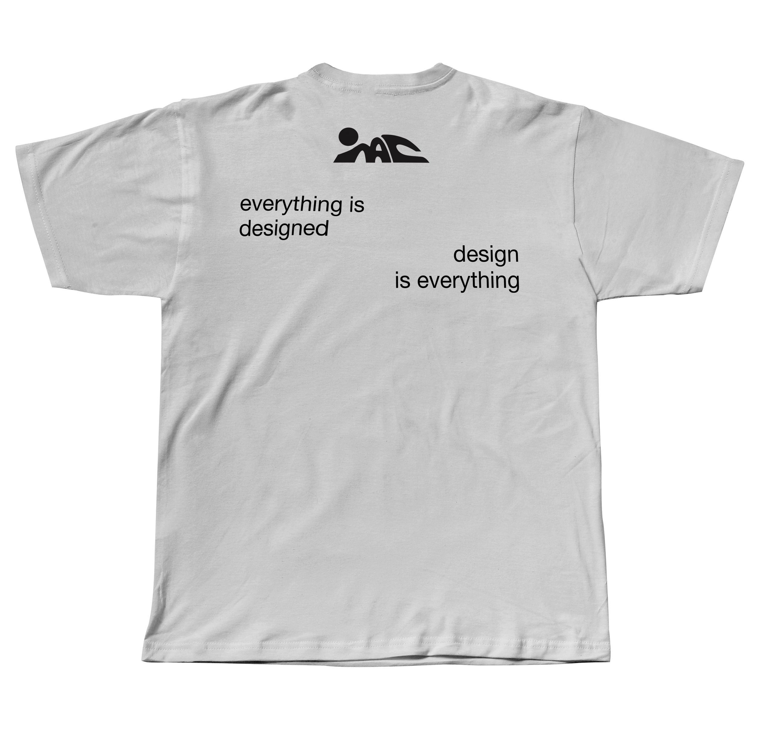
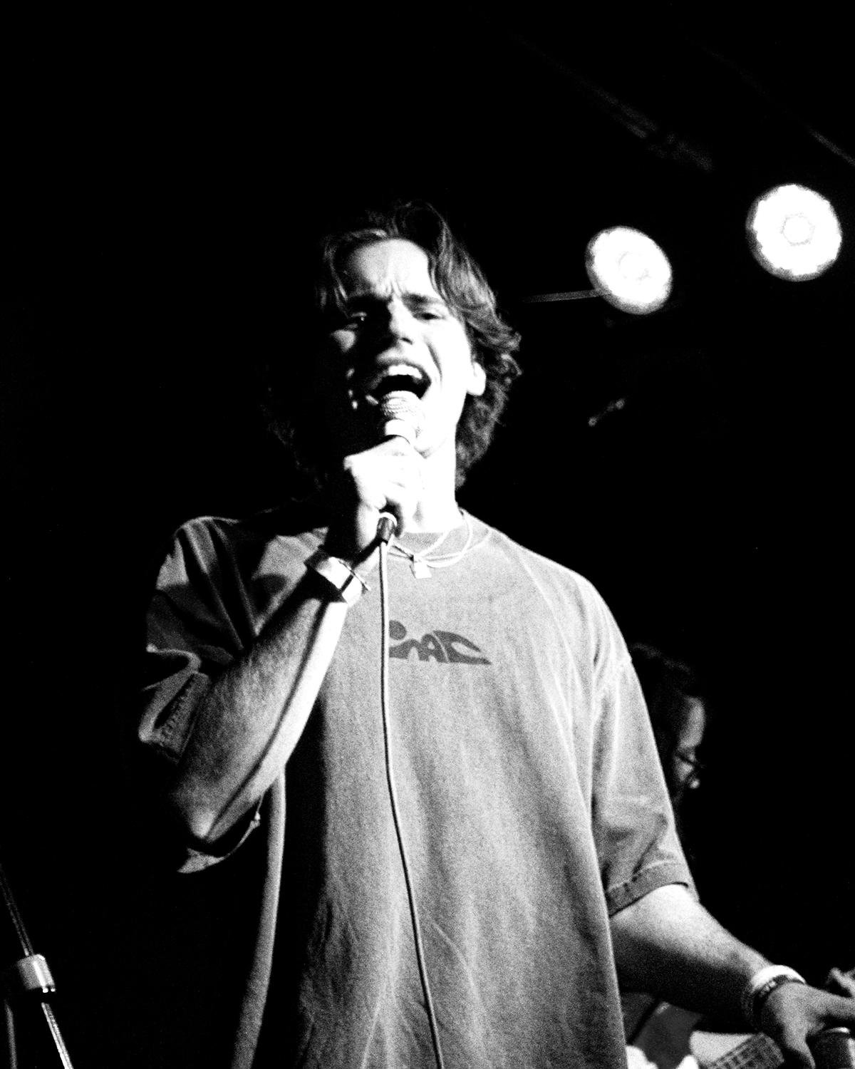
Mac.dsgn
Logo Design, Branding, Apparel DesignMac.dsgn (Mac Design) is my visual identity as a freelance designer and artist. Initially I created the logo as a tag or watermark for my design work and photography. Eventually, I began to expand the concept into a brand encapsulating my interests in art, surfing, and fashion.
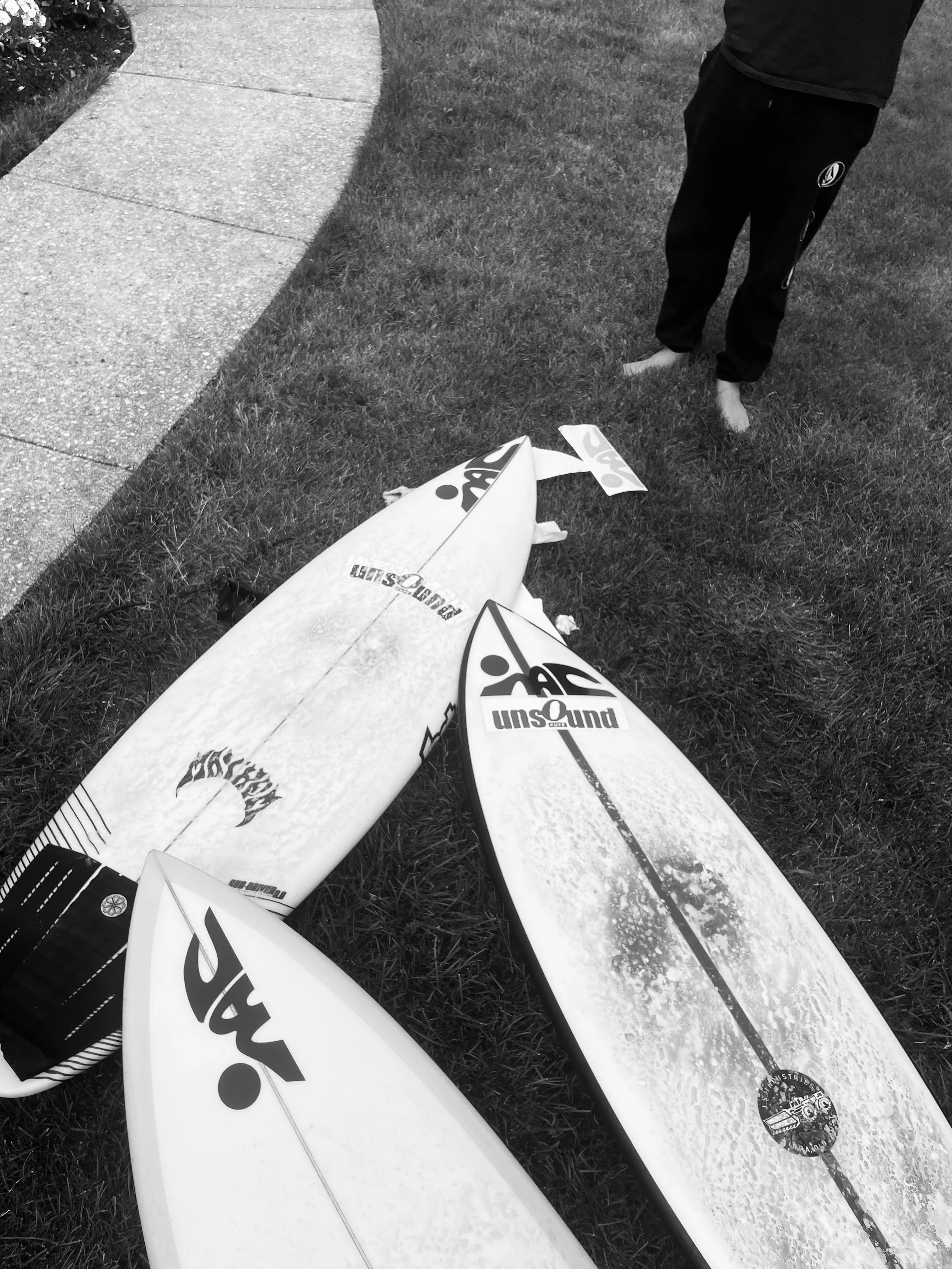

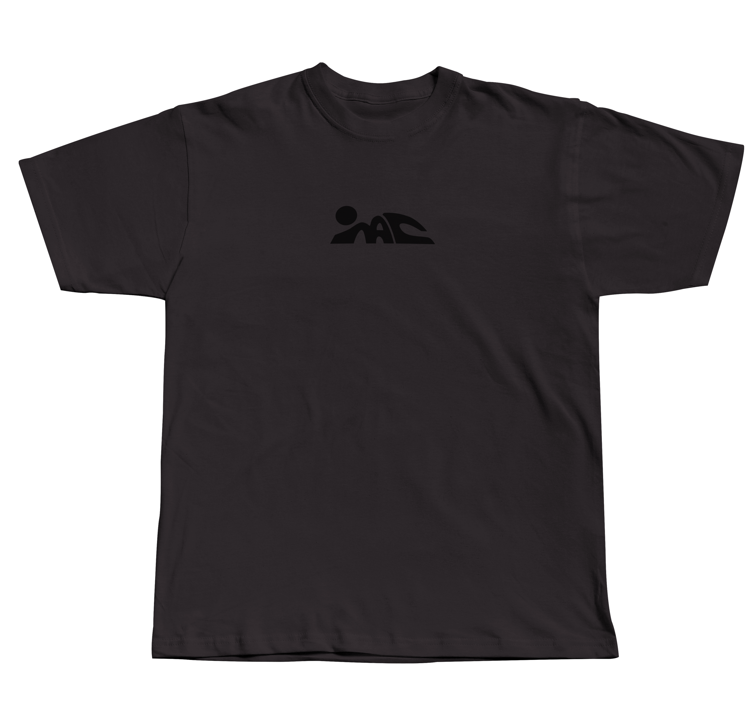
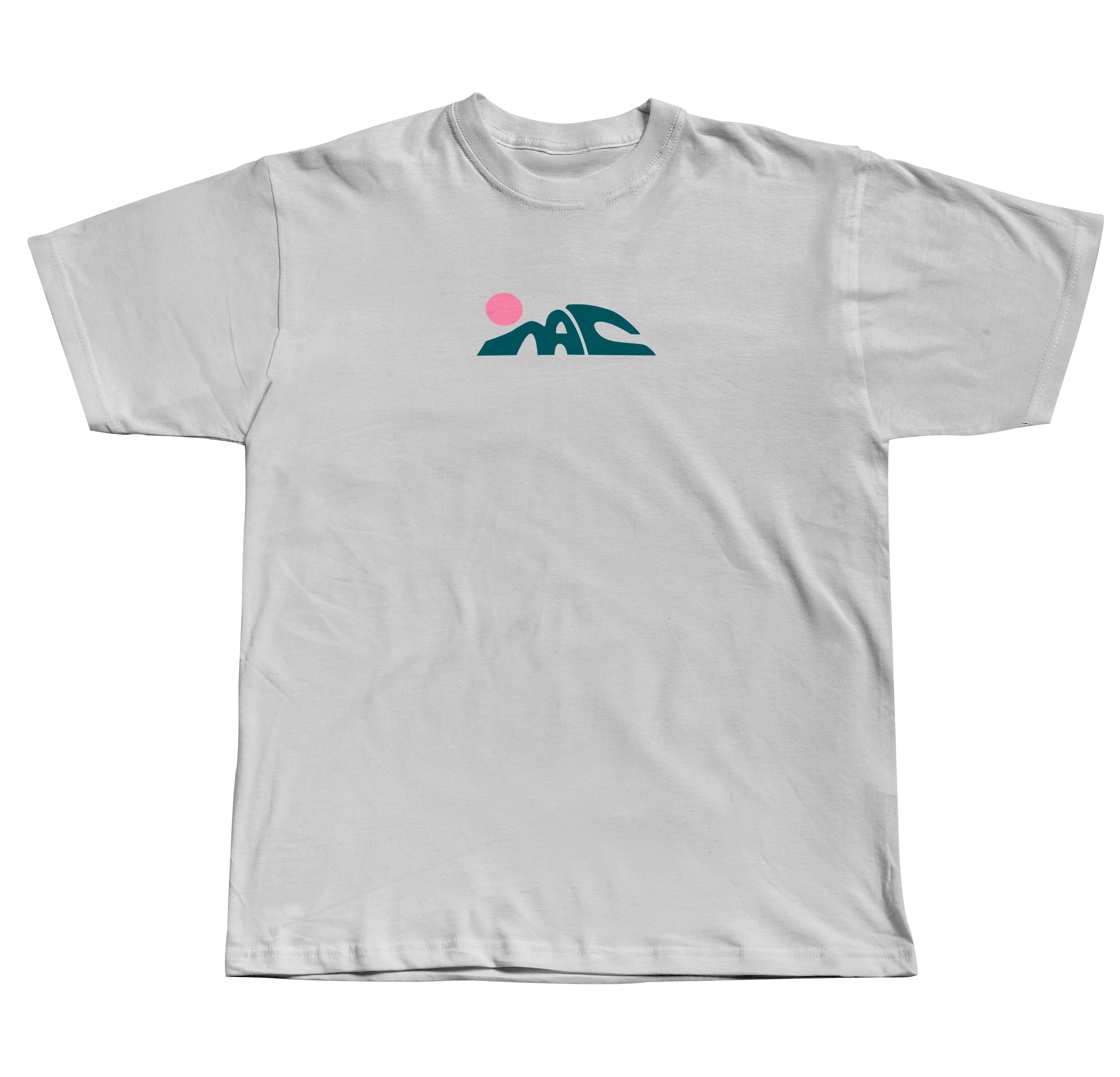
The icon
The icon is meant to toe the line between representation and abstraction, inviting multiple interpretations. The three forms are meant to read as “MAC.” The M and the A hang together, and the C loosely resembles the curl of a barrelling wave. The entire icon resembles a landscape or seascape when viewed from the side, with a setting or rising celestial body; these representational qualities of the logo are meant to invoke my interests in surfing and the outdoors while still maintaining a sense of mystery and sleek simplicity.
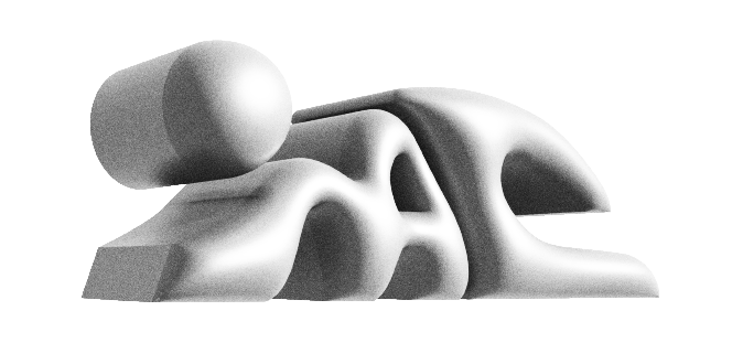
More important than the logo’s representational qualities are its interesting interactions between positive and negative shapes. The negative spaces (the crooks in the M, A, and C, the gap between the A and the C, and the space between the circle and the M) activate the space surrounding the logo, making the entire icon feel grounded on whatever surface it is placed.
The contrast between harsh, straight edges, and gentle curves creates tension and visual interest while the repetition of form, and the overall visual balance of this logo build harmony, allowing the three positive shapes to read as a single unit.